Tabloid
The classic newspaper format, the most popular.

Broadsheet
Large-format newspaper, ideal for impact.

Tabloid
The classic newspaper format, the most popular.
Broadsheet
Large-format newspaper, ideal for impact.
Chapter 3
Get the best color rendering.
Learn how to prepare your images for printing on newsprint for optimal results.
Chapter 3
The selection of photos and artwork is crucial for your newspaper.
Select balanced images to make sure they really stand out.
A too dark image will result in the addition of black ink overall. The outcome will be dull.
A too bright image will have its ink limited below its full potential. The result will be low in contrast, appearing 'washed out'.
The goal, therefore, is to balance your images to achieve a good range of mid-tones, using the entire available color gamut.
Adjust the brightness and contrast of each photo to ensure that each image includes both deep blacks and pure whites.
Too dark image (left), balanced image (middle), too bright image (right):
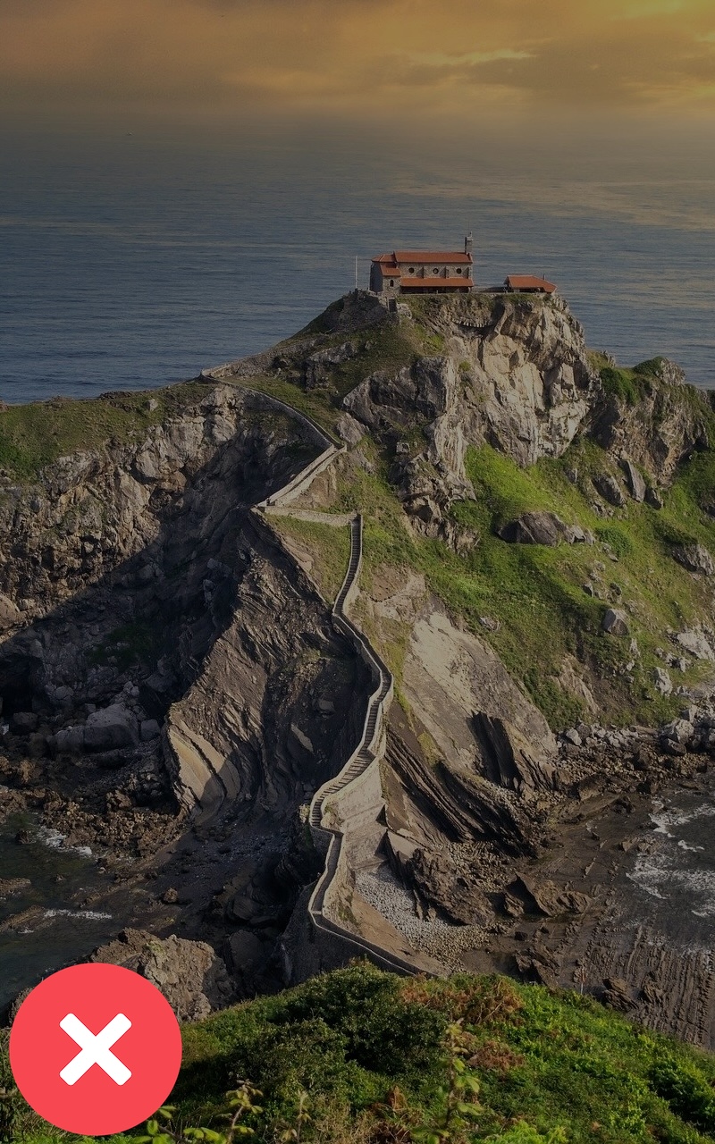
Image too dark.
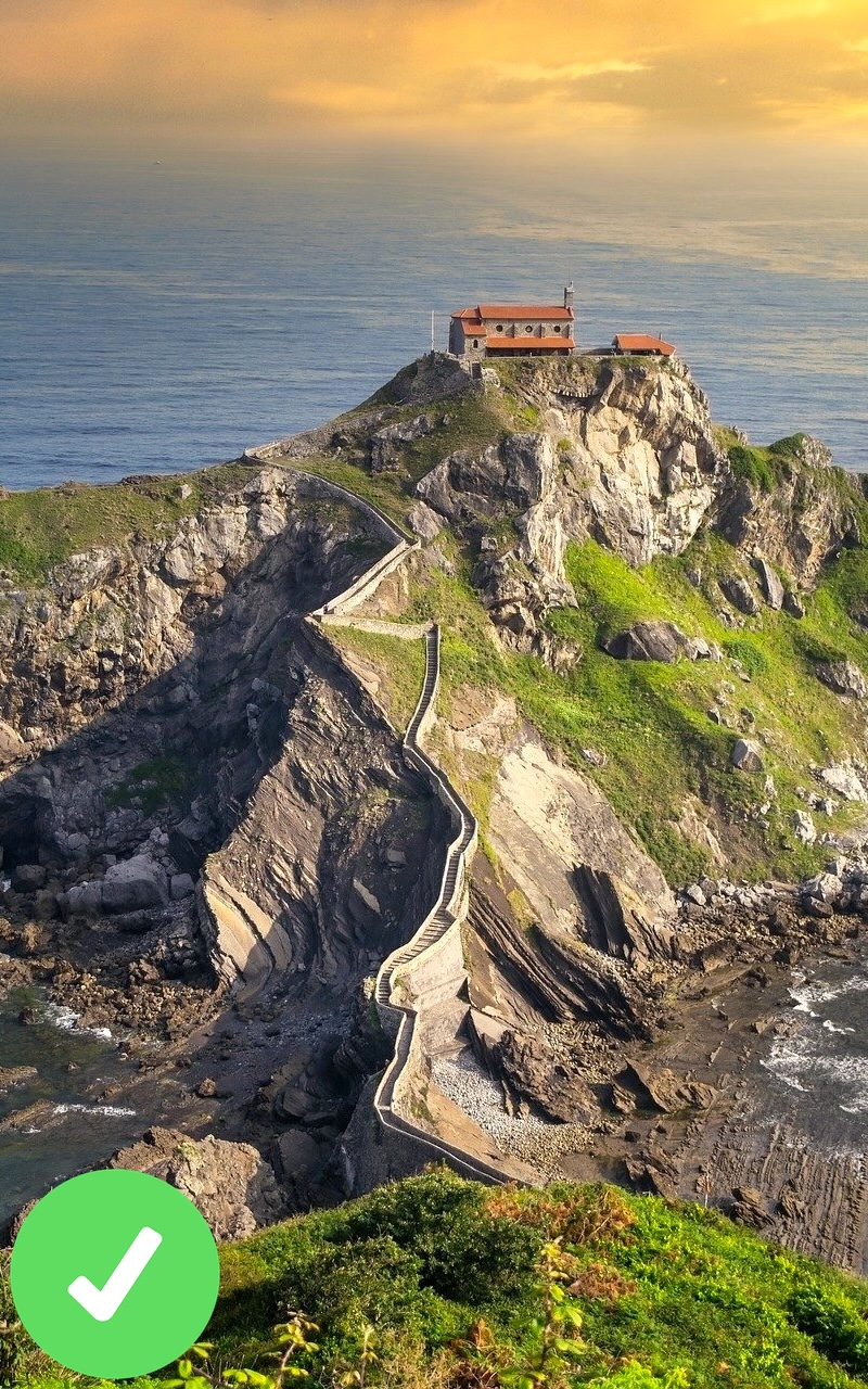
Balanced image.
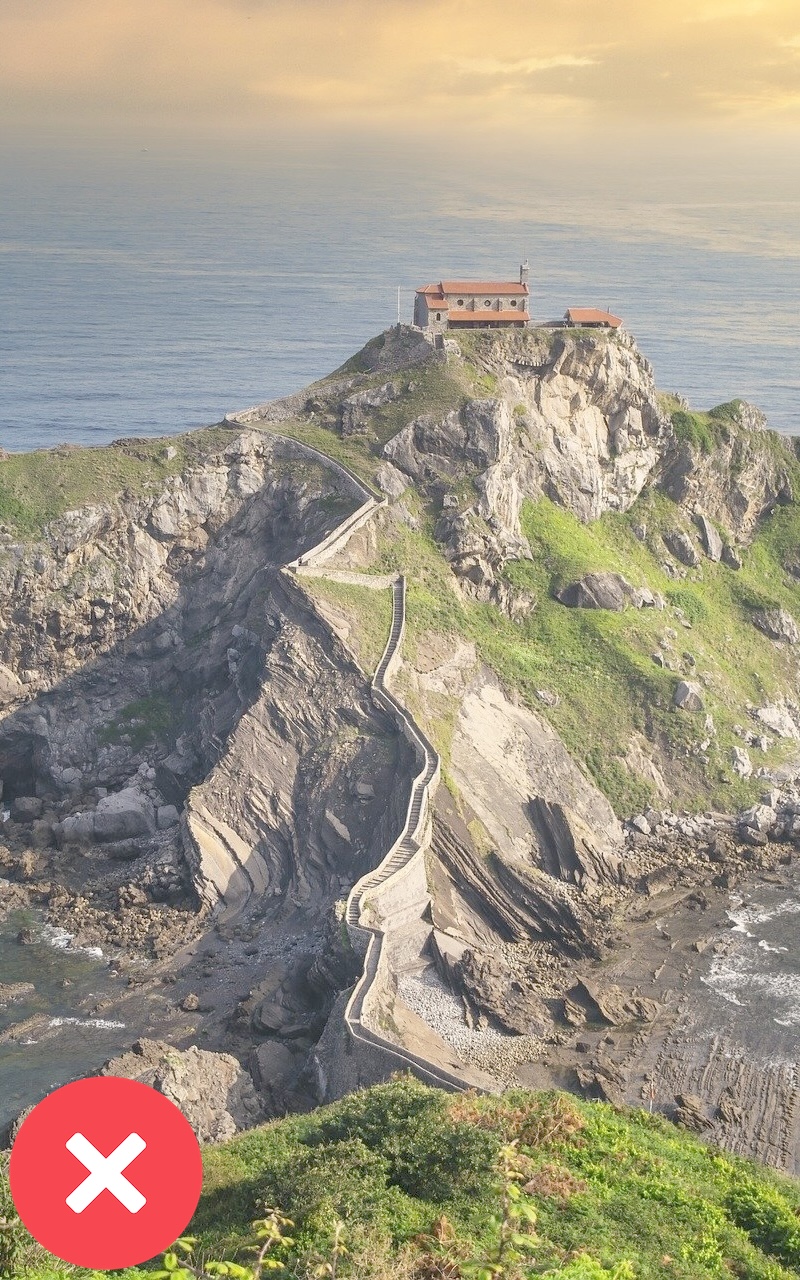
Image too bright.
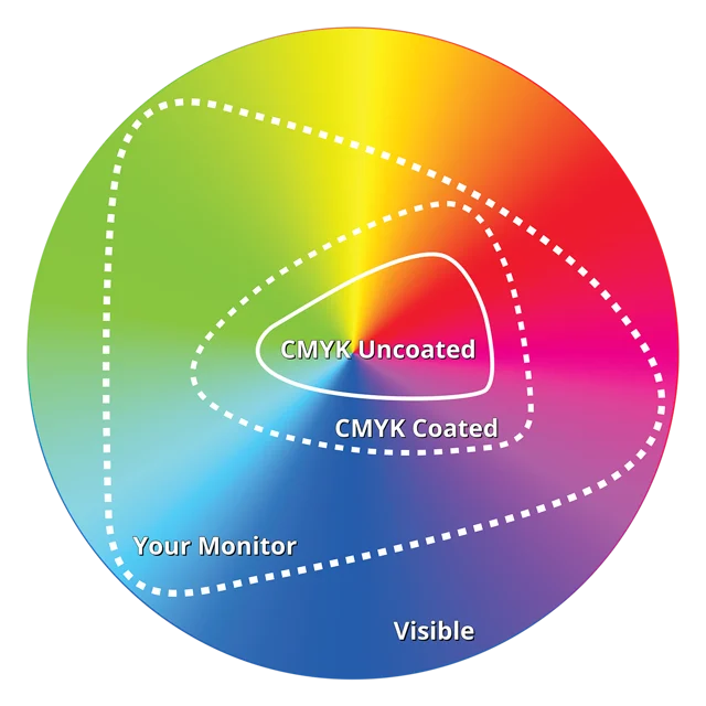
Our newspaper printing press uses Cyan/Magenta/Yellow/Black (CMYK) inks for color reproduction.
This means that your newspaper is composed of a mix of these 4 inks, which is why we recommend exporting in CMYK, not in RGB (Red, Green, Blue), which is suited for screen display.
You can get a screen preview of the colors you will get on paper by exporting with the ICC profile FOGRA39 ISOcoated v2.
PDF versus PRINT:
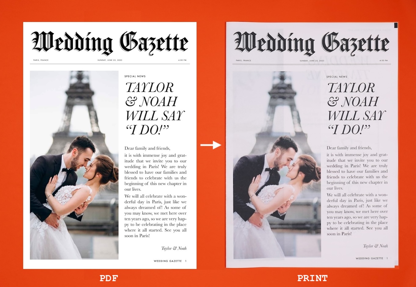
PDF vs printed version comparison.
As you can see in the image below, it is not possible to reproduce on newsprint as many colors as your screen can. That's why it's important to work on your images, convert your visuals to CMYK, and order free samples or a proof to familiarize yourself with the newspaper format.
Color gamut: